Keys to Effective Brochure Design
September 2, 2022
September 2, 2022

Know Your Audience.
Always keep in mind the demographics and preferences of your target customer. Develop a profile of your average or most desirable client and imagine the content and images that would convince them to utilize your product or service over your competitors.
Use Color Carefully.
Understand that different colors can evoke different emotions. For example, red generally conveys aggression and would be perfect for a martial arts studio or gym but not for a doctor’s office which might be better served using cool, calming colors like blue or green.
Think About Your Fonts.
Just like with color, different fonts can convey different attitudes. Fonts can be stern, elegant, funny, aggressive, authoritative, and more. Your font should match your business’s personality and the type of image you are trying to portray. Also consider the size of your font, both in headlines and as your brochure’s text. You want it to be easy to read and legible for your target audience while still maintaining a style and layout that represents your business in the best way.
Use Professional Images.
With the wide availability of professional images in today’s business world, there is no excuse for using grainy or unprofessional images. Professional, royalty-free photos, illustrations, and vector graphics can be purchased for as little as $10 per image on websites like iStock and Shutterstock. Some websites like Pixabay even offer free images with no restrictions on use. A small investment today will yield big results in the final product and the images you purchase can be used in all your marketing, advertising and social media activities.
Utilize Different Shapes and Sizes.
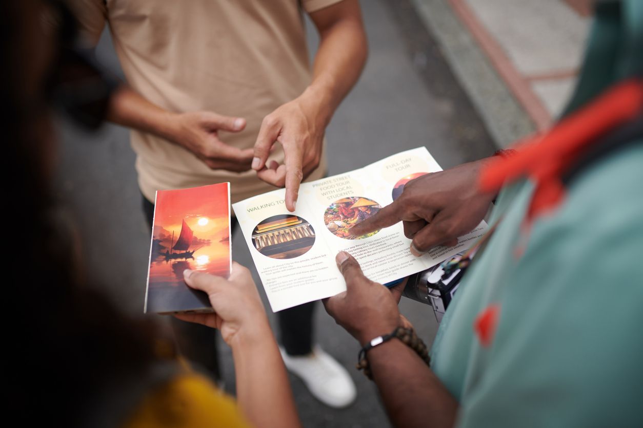
While tri-fold and bi-fold brochures are by far the most common type, don’t be afraid to try something different. A brochure that is a larger or smaller size, multiple pages or die-cut can be visually dynamic and set your brochure apart from the pack. Also consider using unique paper stocks to differentiate the feel and look of your brochure.


By Lisa Rabzak, Owner
•
October 11, 2025
Do you love the company you work for, but feel stagnant in your current role? Are you looking to advance your career with more direct responsibilities? Crafting a resume that is specifically focused on a promotion can help you achieve that goal. Most people believe that you only need a formal resume when applying for a new position outside of your current employer. The truth is that a resume is a key ingredient for successful internal promotions, allowing you to differentiate yourself from a pool of candidates. First, a resume gives you the opportunity to highlight your accomplishments, focusing on achievements and the impact you have had within your current and past roles with the company. Second, a resume can help provide specific insight into the skills you have developed that will help you thrive in the new role. Last, a resume offers a platform to demonstrate your commitment to advancing the strategic priorities of the company through your individual contributions. Looking for help in crafting a resume for an internal promotion? Contact Lisa Rabzak Marketing Services at 717-371-5302 or email us at lisarabzak@comcast.net.

By Lisa Rabzak, Owner
•
October 8, 2025
In short - YES! Brochures and other printed materials, like flyers, postcards, catalogs, and booklets, offer a tangible, memorable, and cost-effective way to reach customers and build brand credibility. Their physical nature provides a unique, screen-fatigue-free experience, which can lead to higher engagement and retention rates compared to just digital content. Brochures also encourage longer reading times, allowing for deeper engagement with key messages and a higher chance of being kept for future reference. They offer a physical connection to your brand, providing a tactile experience that digital platforms can't replicate, leading to enhanced memorability and brand credibility. To be effective, brochures need a clear design, quality content, a strong brand identity, and a clear call to action. High-Quality Design: A visually appealing design with eye-catching graphics and photos is crucial for capturing attention. Clear Content: Content should be well-written, informative, and clearly explain your business and its offerings. Strong Call to Action: Include clear instructions on what you want the reader to do next, such as visiting a website or calling a phone number. Brand Consistency: Ensure your brand's colors, fonts, and logo are used consistently to reinforce your brand identify. Interested in designing a new brochure or upgrading your current one? Call 717-371-5302 or email lisarabzak@comcast.net today!

